VALP MACIEJ HAJNRICHArt Director & Visual Artist
Graphic illusionist.
Co-founder of Seledyn Studio.
selected works ↓
Make your event shine
I create unique visuals that level up the event experience — working directly with organizers and the marketing team to bring creative solutions
from A to Z.
As an art director and artist, delivering visual strategy and custom key art for events, concerts, festivals and beyond.
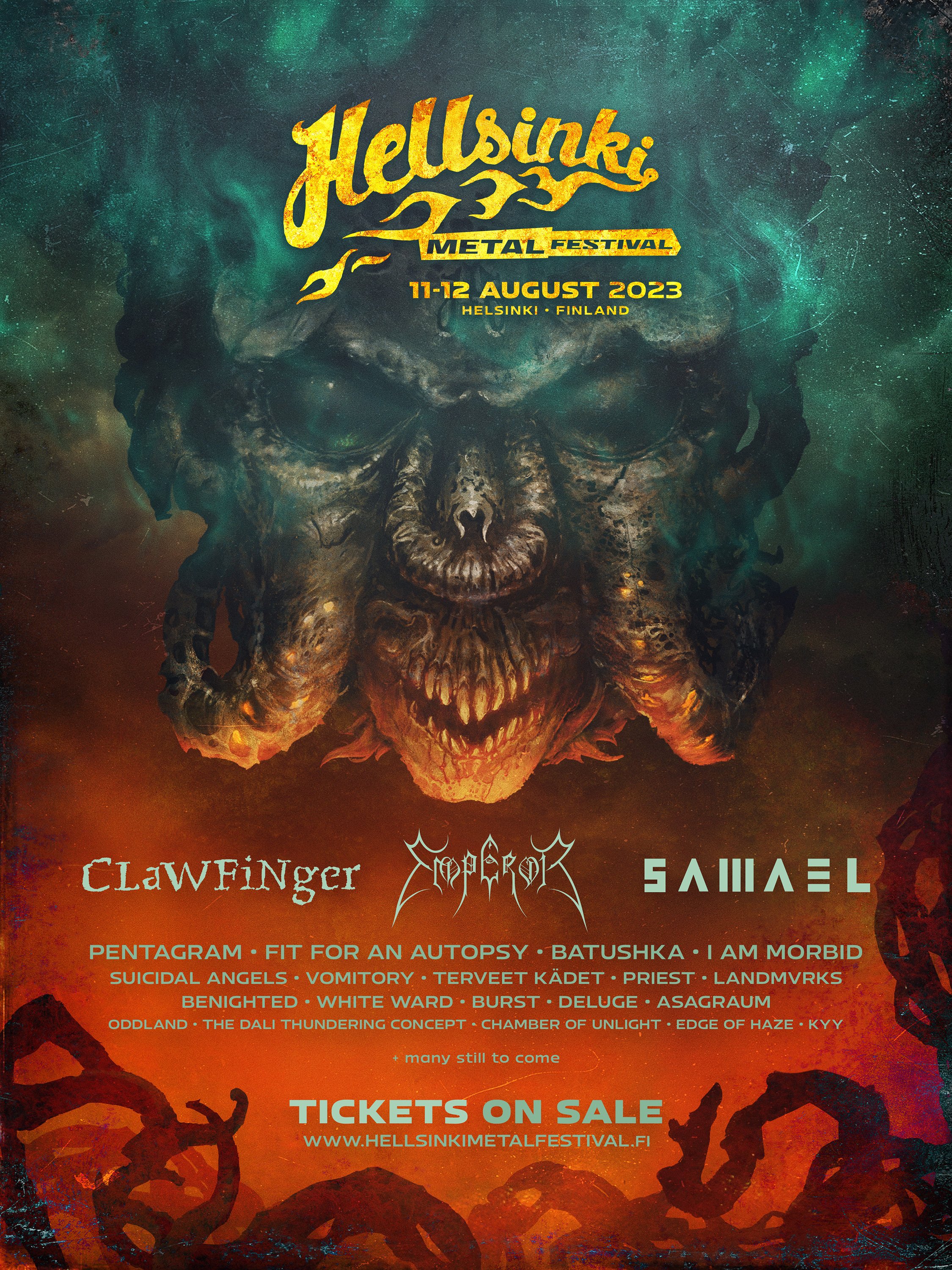
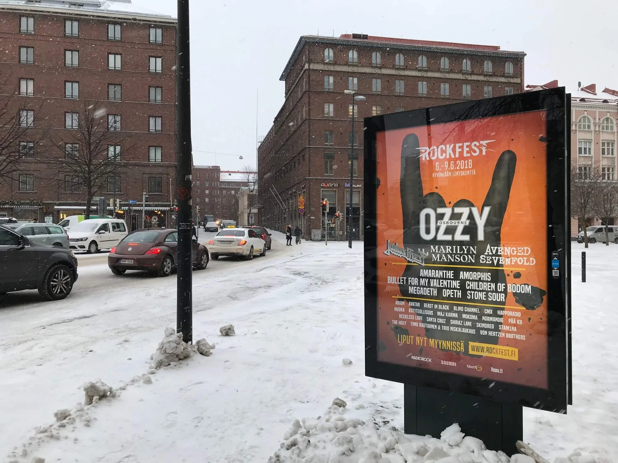
I have worked for the Hellsinki Metal Festival (2023), Weekend Festival (Finland, 2017-2018, 2021-2023), Rockfest Festival (Finland, 2017-2019), and Summer Sound Festival (Latvia, 2022-2023), among many other events.
Problem-solving approach
Finding a way to promote a brand with a unique approach can be a never-ending story. My process is always with custom-created art — so your business gets attention and desired growth.
Check out more details about my experience → About.

Pure Art!
Each product needs a unique concept, whether a mouse pad, video game packaging, board game, or skis. I serve them all (and beyond) with the power of digital art.
See the image with the skier? It’s here because I’m proud to be a member of Armada Skis Artists and had an opportunity to create a few sets of custom artworks while four (4) were in stock.

Delivering a visual language for brands and products is my focus.

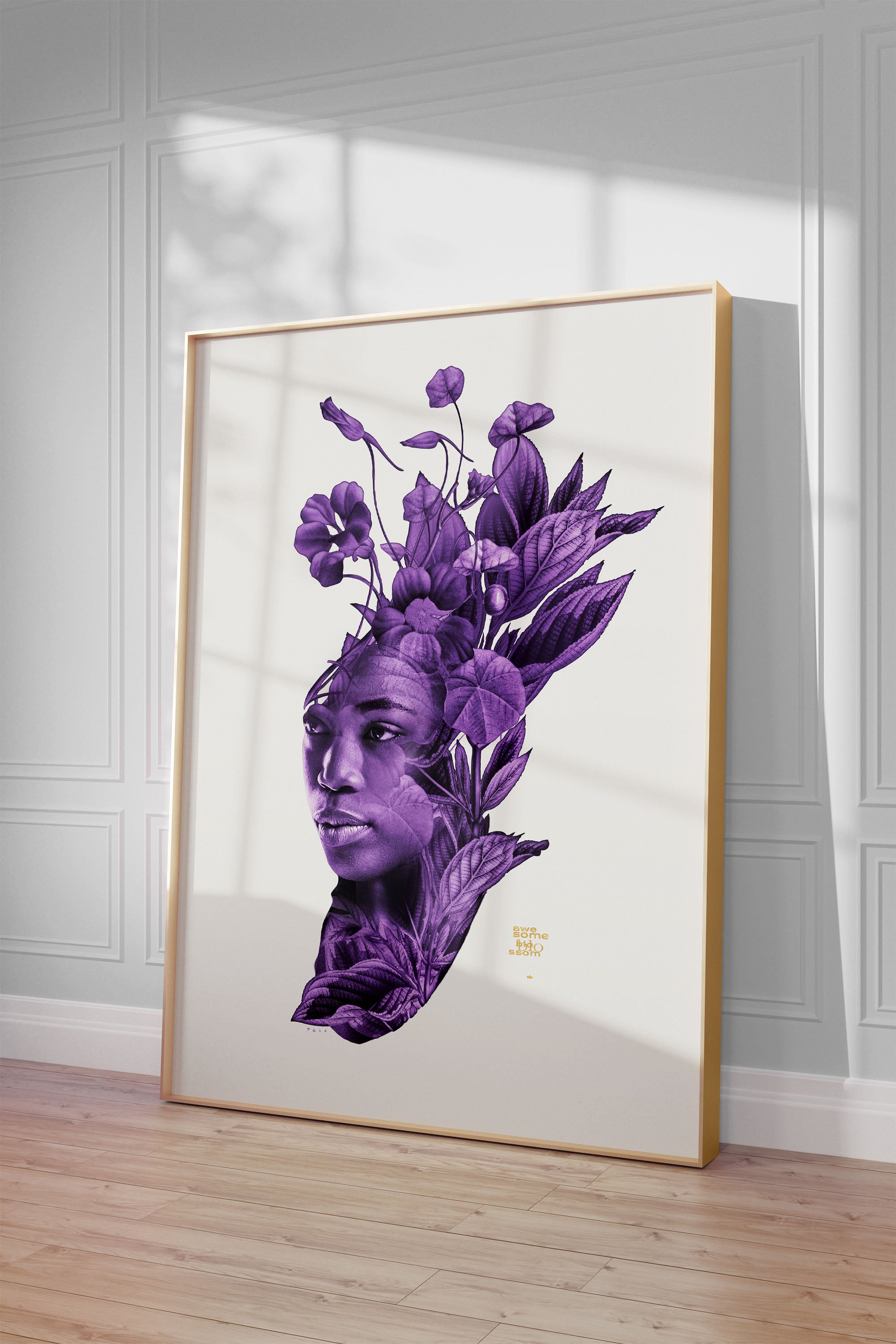
Digital illustration
I enjoyed helping various bands and musicians grow their recognition with unique album cover art. Some of my favourite projects include Pendulum, Knife Party, Socionic, Ania Szarmach, a few smaller pieces for Monstercat, and many more.


Creative services
-
Do you have an idea but don’t know where to start? Let me take care of the visual aspect of your project.
-
I’m serving digital & print. Outdoor campaigns, event production, covers, creative retouching and many, many more.
-
My second project — Seledyn Studio — is a 100% branding studio. Go ahead and check our pages for logo, identity, and more.
Posterland
〰️
Posterland 〰️

will return in 2024
The poster shop is temporarily down, but stay tuned since a new collection is already in progress.